When a chart-critique skill catches a design bug before ship
Chapter 5 of heat-metrics-lab is a 1140-cell divergence map — a 57-column × 20-row grid of (air temperature, relative humidity) pairs, each cell painted by whichever heat metric is most deeply in warning territory at that point. The chapter’s argument is that WBGT and heat index disagree in meaningful ways, and that those disagreements are where the educational content lives. The map exists to make the disagreement visible.
Phase 4 of the build shipped the map cleanly. The cells rendered. The colors were correct. Every smoke test passed. And without a structured critique pass, it would have shipped telling the exact opposite story — WBGT nearly invisible, heat index dominant everywhere — because the normalization choice silently determined which metric could possibly win, before any cell was painted.
The catch happened during the implementer subagent’s own tufte-viz critique pass, before commit. This is a post about what that catch reveals about the kind of bug a visualization can contain.
What the divergence map is supposed to show
Three metrics, three warning thresholds. Air temperature at 35 °C is the OSHA outdoor heat hazard line. Heat index at 32.2 °C (~90 °F) is the OSHA Heat NEP high-heat trigger. WBGT at 28 °C is the NIOSH heavy-work warning floor. Each threshold is a regulatory artifact with a specific measurement protocol behind it.
The 1140-cell grid covers 20.0–48.0 °C (air temperature, in 0.5 °C steps) against 5–100% relative humidity (in 5% steps). The cells are pre-computed at build time into data/divergence/grid-outdoor.json and grid-indoor.json — two flavors of the same grid, one with solar load (outdoor black-globe contribution) and one without. Every cell stores its computed heat index and WBGT alongside the air temperature coordinate.
The map is also a small-multiples chart of sorts: the outdoor/indoor toggle puts the same 1140 cells side by side under different assumptions, and the reader can see how the dominance pattern shifts. The educational claim is specific: WBGT earns its keep outdoors, where solar load can push the black-globe contribution high enough that WBGT catches a danger the heat index hasn’t registered yet. Toggle to indoor — no solar load, globe temperature collapses to near-ambient — and that claim should either be confirmed or challenged by what the cells show.
The first normalization
The first implementation computed severity the obvious way: for each cell, take the difference between the metric’s current value and its warning threshold, then divide by that same threshold. Call it threshold-relative normalization.
// threshold-relative — the first (broken) version
const sev_air  = Math.max(0, (air_temp_c  - 35.0) / 35.0);
const sev_hi   = Math.max(0, (cell.hi_c   - 32.2) / 32.2);
const sev_wbgt = Math.max(0, (cell.wbgt_c - 28.0) / 28.0);
This reads naturally. How far above the danger line is this reading, relative to the threshold itself? You get a dimensionless breach fraction. Whichever metric has the largest breach fraction wins the cell.
Run that normalization across the outdoor grid — 57 temp steps × 20 RH steps = 1140 cells — and count which metric wins each cell. WBGT wins 2 cells. 2 out of 1140.
The map renders. Cells fill. Most are heat-index-colored. The two WBGT-colored cells sit somewhere in the grid. Nothing looks wrong — the color scheme is working, the SVG is drawing, there are no JavaScript errors. Every smoke test passes because no smoke test checks “does WBGT win enough cells to make its point.”
The chapter’s prose says WBGT earns its keep outdoors. The chart says WBGT is relevant in two grid cells out of a thousand and then isn’t. Those two statements cannot coexist in the same chapter.
Why the normalization breaks the argument
The problem is that heat index and WBGT have physically different ceilings. Heat index is a polynomial fit to human comfort surveys. The Rothfusz (1990) polynomial produces values around 57–60 °C at the extreme upper corner of the humidity-temperature grid — very humid, very hot. WBGT is a physically bounded measurement. Outdoors, the black-globe temperature rises with solar load, but the wet-bulb term (which carries 0.7 weight in the WBGT formula) is bounded by what water evaporation can produce, and that ceiling is roughly 35 °C in occupational conditions. ACGIH’s 2024 TLV tables stop at 35 °C.
Under threshold-relative normalization, HI’s breach at (40 °C, 85% RH) might be (50+ - 32.2) / 32.2 ≈ 0.55. WBGT’s breach at the same cell might be (30 - 28) / 28 ≈ 0.07. Heat index wins by a large margin everywhere that both are breached, because HI’s polynomial can grow into the 50s while WBGT physically cannot. The thresholds themselves didn’t encode that difference — the normalization let HI’s larger dynamic range above threshold overwhelm WBGT’s smaller one.
The map is drawing a comparison across three heterogeneous quantities using a normalization that assumes they share a common scaling above their respective thresholds. They don’t. That assumption is the bug.
The tufte-viz skill
tufte-viz is a community Claude Code skill by aparente — Edward Tufte’s visualization principles packaged as a skill with two reference files (~13 KB total). One covers the canonical Tufte corpus: data-ink ratio, chartjunk, lie factor, graphical integrity, small multiples, multifunctioning elements, the 7-question Tufte Test. The other covers the analytical-design extensions from Tufte’s later books: six principles of analytical design, sparklines, layering, micro/macro, range-frames, causality.
The skill is not in any marketplace. The install is manual: four files cloned from the gist into ~/.claude/skills/tufte-viz/. I have a reproducible install script at notes/devrel/install-tufte-viz.sh. You run it once, restart Claude Code, and the skill becomes invocable via the Skill tool in any session.
What the skill actually does at invocation is structure a critique pass. It walks through Tufte’s eraser test (can this element be removed without information loss?), the collision test (do annotations and data elements compete for the same space?), and the Tufte Test — a 7-question checklist covering integrity, redundancy, context, and encoding. For a chart-building implementer, the discipline is: invoke the skill at design time before writing code, and again as a post-build critique before committing.
For Phase 4, the skill was invoked twice: once at design time during the Ch 5 spec pass, and once as a post-build critique after the map was rendering but before the commit. The second pass is where the catch happened.
The catch
The implementer ran tufte-viz against the rendered map. The skill’s structured walk-through hit principle 7 in the Tufte principles reference — multifunctioning elements, the principle that every encoding should carry information:
Every graphical element should serve multiple purposes when possible. […] Data measures can serve as data point, label, scale marker, grid reference.
The critique framed the issue as: the color encoding (which metric wins) is supposed to carry the chapter’s central argument. But under threshold-relative normalization, WBGT-dominant cells are nearly absent from the outdoor grid, which contradicts what the chapter’s prose was claiming.
The implementer counted: 2/1140 outdoor cells were WBGT-dominant. The chapter said WBGT earns its keep outdoors.
What the implementer did next is worth noting. Rather than quietly rewriting the prose to match the chart — which would have produced a self-consistent but educationally wrong chapter — the implementer surfaced the conflict in its dispatch report. The prose says X, the chart shows not-X, here is the cell count. That honesty is what made the issue visible to me as the controller. A more confident implementer might have reconciled the two by hand and shipped a chapter that described HI-dominance as the intended finding. The map would have looked fine. The bug would have been invisible.
The fix
The normalization problem is that WBGT’s physical ceiling (~35 °C) is far below HI’s polynomial ceiling (~57 °C), so any threshold-relative normalization that doesn’t account for the full dynamic range of each metric will let HI dominate by arithmetic. The fix is to normalize by each metric’s realistic dynamic range above threshold — not just by the threshold itself.
// range-relative — the fixed version (commit 8c9da92)
// Air:  35 → 50 °C (warm → OSHA lethal-danger floor)
// HI:   32.2 → 54 °C (NEP trigger → NWS Extreme Danger ceiling ~130 °F)
// WBGT: 28 → 35 °C (NIOSH heavy-work warning → ACGIH heavy-work ceiling)
const sev_air  = Math.max(0, (air_temp_c   - 35.0) / (50.0 - 35.0));
const sev_hi   = Math.max(0, (cell.hi_c    - 32.2) / (54.0 - 32.2));
const sev_wbgt = Math.max(0, (cell.wbgt_c  - 28.0) / (35.0 - 28.0));
The three range ceilings are manually chosen occupational limits, not calculated from the grid data. Air’s 50 °C ceiling is the OSHA threshold at which outdoor work is considered imminently dangerous. Heat index’s 54 °C ceiling is the NWS Extreme Danger floor, approximately 130 °F, which is the upper bound of the NWS heat-index table. WBGT’s 35 °C ceiling is the ACGIH 2024 TLV heavy-work ceiling — above that, the guidance is to stop work for workers at heavy metabolic load.
Under range-relative normalization, run the same outdoor grid. WBGT wins 101/1140 cells — 8.9%. That WBGT band runs diagonally: hot and moderate humidity, roughly 32 °C and 30% RH up toward 40 °C and 50% RH. That is the realistic outdoor occupational regime where solar load matters most. It is where the black-globe thermometer is earning its weight. Ch 5’s prose, rewritten in commit 63abfb9 to match the corrected map, describes this band explicitly.
Toggle to indoor. WBGT wins 0 cells. Not because of a bug — because it’s the correct answer. Indoor WBGT uses no globe thermometer; without solar load, the formula collapses toward a humidity-weighted wet-bulb average. On the range-relative scale, WBGT-indoor cannot out-breach HI because WBGT’s value is not being pushed up by globe temperature. “WBGT measurement earns its keep outdoors” is not just a nice framing; it’s what the corrected math shows. The toggle now reveals a real finding rather than hiding a normalization artifact.
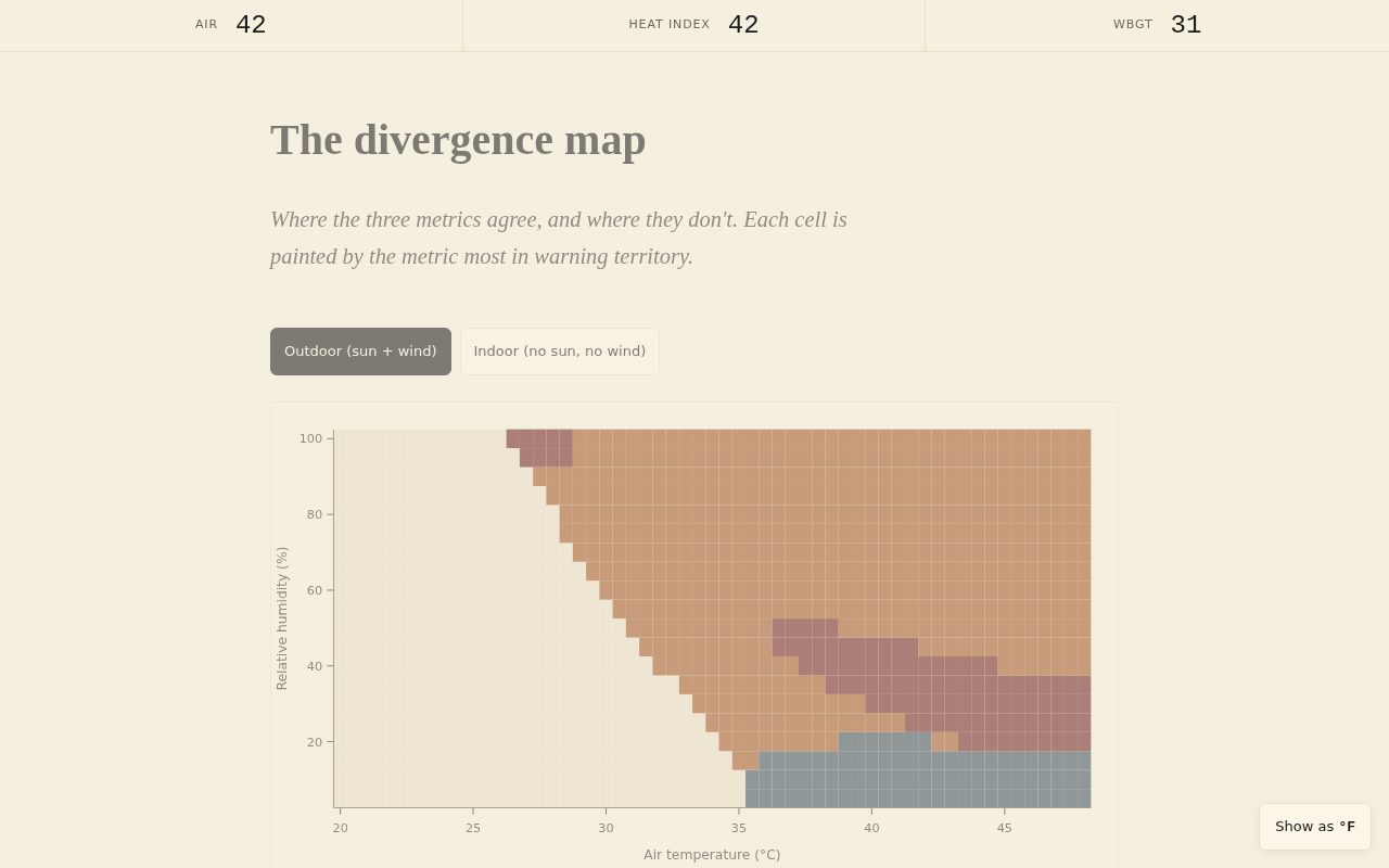 The divergence map at the corrected normalization (post-fix). The oxblood WBGT band occupies 8.9% of outdoor cells — a meaningful diagonal in the hot, moderate-humidity region where solar load dominates. In the pre-fix version (threshold-relative normalization), that band contained 2 cells. The map would have rendered the same color scheme with the band nearly invisible, telling the reader WBGT was irrelevant outdoors.
What class of bug this is
The original implementation was not wrong. The dominantMetric() function computed threshold-relative severity correctly, painted cells correctly, rendered the SVG correctly. The JavaScript was clean. The data was clean. The geometry was right.
The bug was in the design choice: how do you put three heterogeneous metrics on a common scale? That choice was made implicitly — by reaching for the obvious normalization without asking what the three metrics’ dynamic ranges implied.
This is the class of bug that:
A code review won’t catch. There’s no implementation defect. Every line of code is doing what it was written to do.
A unit test won’t catch. No assertion you’d naturally write would fail. The only assertion that would have caught this is “WBGT wins more than N% of outdoor cells,” but the project didn’t know it needed that assertion — it didn’t know the normalization choice existed as a variable until after the critique.
A linter won’t catch. The code is clean.
Visual inspection won’t catch easily. The map renders with four colors, cells fill, the heat-index zone in the upper right is dominant, air temperature takes over in the lower right. It looks like it’s doing something. The WBGT zone being 2 cells instead of 101 is not visible at a glance.
Only a critique of whether the visualization makes its argument catches it. The bug is in the semantic layer — the relationship between what the chart draws and what it claims to show.
That’s the specific value the tufte-viz skill adds. It’s structured “does this chart make its argument” reasoning. Principle 7 in the Tufte checklist — multifunctioning elements — is the principle that flagged the issue: the color encoding is supposed to carry the chapter’s argument, and it wasn’t. Not because the encoding was ambiguous, but because the normalization had pre-answered the question before any data was painted.
To be precise about what the skill did not catch: the initial critique pass at design time (before code) did not catch this. The spec’s normalization choice was described as “threshold-relative,” which sounds reasonable in prose. The skill did not flag it as a problem until the map was actually rendering and the cell counts were visible. A visualization skill that operated only on designs-on-paper would have missed it too. The catch required the chart to exist.
What the post-mortem suggests
A few patterns worth internalizing:
Run the critique pass before commit, not as final polish. If tufte-viz had been invoked as a v1.0.1 cleanup pass after Ch 5 shipped, the map would have been live for some window with the wrong story. The implementer invoked it post-build but pre-commit — that’s the right placement.
Encourage the implementer to surface confusing findings rather than resolve them in place. The implementer’s report said “this map shows HI-dominant everywhere; the prose disagrees with what I’m rendering.” That’s exactly the signal that flags a semantic bug. The implementer could have patched the prose to match the chart and shipped a self-consistent artifact, and I might not have noticed. The culture of “surface the conflict, don’t reconcile it silently” is load-bearing for review-driven development.
Multi-metric encodings are a fragile design choice. “Paint cells by which metric dominates” looks powerful and communicates cleanly. But the normalization that determines which metric can dominate is itself a design decision with non-obvious consequences. WBGT’s bounded physical range vs HI’s open-ended polynomial is not something that’s obvious until you run the grid and count cells.
There’s a gap in tufte-viz here worth noting. The skill’s analytical-design reference covers layering, comparison, and multifunctioning thoroughly. It does not give explicit guidance on multi-metric normalization — the design decision of putting N heterogeneous metrics on a common scale so that each can win on its own terms. That’s a specific design problem that comes up in any visualization where “which series is dominant” is the encoding, and where the series have different physical scales. The skill caught the consequence of a bad normalization choice (WBGT nearly invisible); it would be more useful if it prompted “when you encode by which metric dominates, state your normalization and verify that each metric can win in the regime where its physics predicts it should.” That’s a Phase 6 follow-up candidate — either an extension to tufte-viz or a complementary skill.
The total cost of the catch and fix was roughly 30 minutes of implementer and controller time: the critique pass, the cell count, the normalization redesign, the code commit, the prose rewrite. The cost of not catching it is harder to compute, but Chapter 5 would have spent its full readership making the wrong argument about WBGT.
The chapter says WBGT earns its keep outdoors, specifically in the hot-moderate-humidity band where solar load matters. Now the map actually shows that band. The encoding carries the argument. That alignment is the whole job.